SRGE SIPS vol. 2: Make it Wonderful
unclench your jaw, it’s like a 3 minute read my love
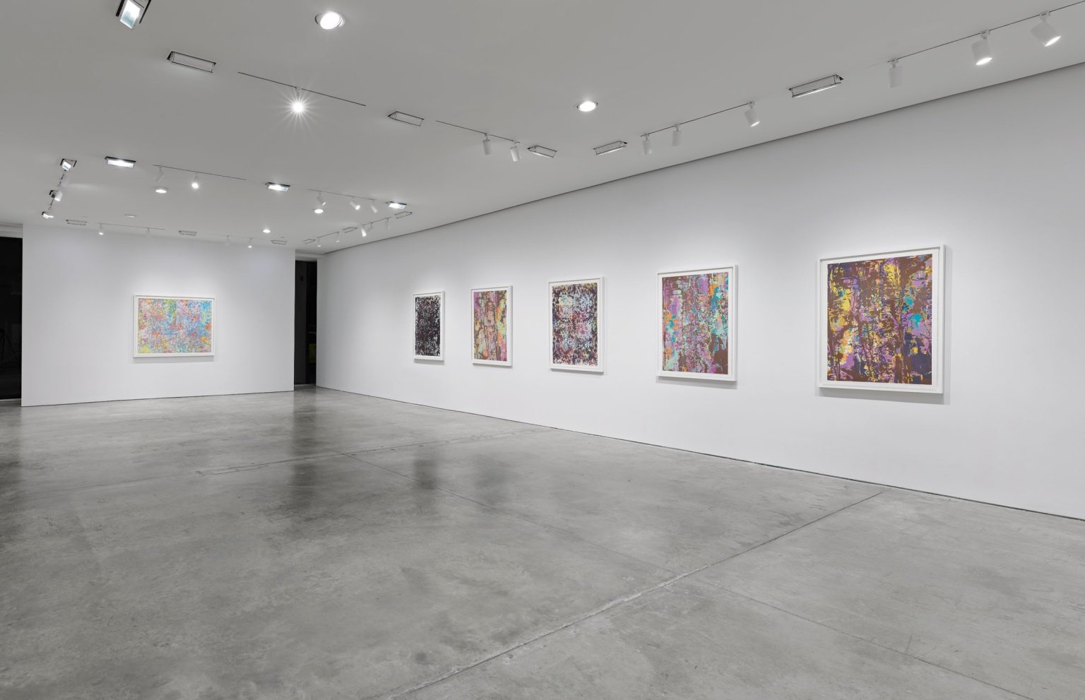
Installation View: courtesy of Pace Prints
rest in peace, mr. gilliam. you were a giant.
Sippers. Hello. After a month-long hiatus, i have returned to atone for my sins. I skipped two weeks of exhibitions, so these next NINE reviews are backlogged as all hell. Why was I gone? That’s a secret I’ll never tell, but I am here reporting for my 1-2 readers (love you dearly <33) from my couch in Chicago, black coffee in hand, and a whole bunch of shit to talk. Shall we?
the rundown:::: Make It Wonderful is comprised of thirteen large monotypes. A few in grayscale, the majority in bright pastels.
raw rating: 6.8/10
the work as an entity: 8/10
installation— sure, i guess.
booze?— yes, and generous!
demographic: 24-28 y.o hot POC and 33-90 y.o whites— overall solid sexy rating
time spent: 12 minutes (my avg is 6 min when going out for reviews!)
— my immediate reaction: braille. Flattened, futile braille. In doing my post-show research, my initial response was substantiated. In Gilliam’s final body of work before his passing in 2022, he noted the importance of tactility in his process:
“When you run your hand across the surface, you can feel how it is made... A blind person is the one who sees.”
we thank Sam Gilliam for his contributions to the lineage of american art, making history as a black color field artist.
—
Sam Gilliam at Pace Prints. Now, let me tell you a little something about PP. This is the typa spot you’ll step foot in and be rapidly humbled. I’m not entirely sure what it is about this particular gallery that makes you feel like you’re in the ninth grade staring at seniors smoking pot, hoping one of them will talk to you. it’s sort of endearing. I mean, ofc its part of the Chelsea machine, which typically has no affect on my spirit, but whenever I enter Pace Prints, I do in fact go mute. That’s a me problem, but its kinda funny.
—
Upon first glance, I recall a wash of nostalgia arising. The fragmented color planes immediately transported me to that one day in art class where my instructor had us make a collage over yarn and then pull up the yarn to rip into the fleshy layers of mod-podged paper. The process of building, then tearing and facing the history of your hands’ work.
Today, I am solely going to speak on the following piece:
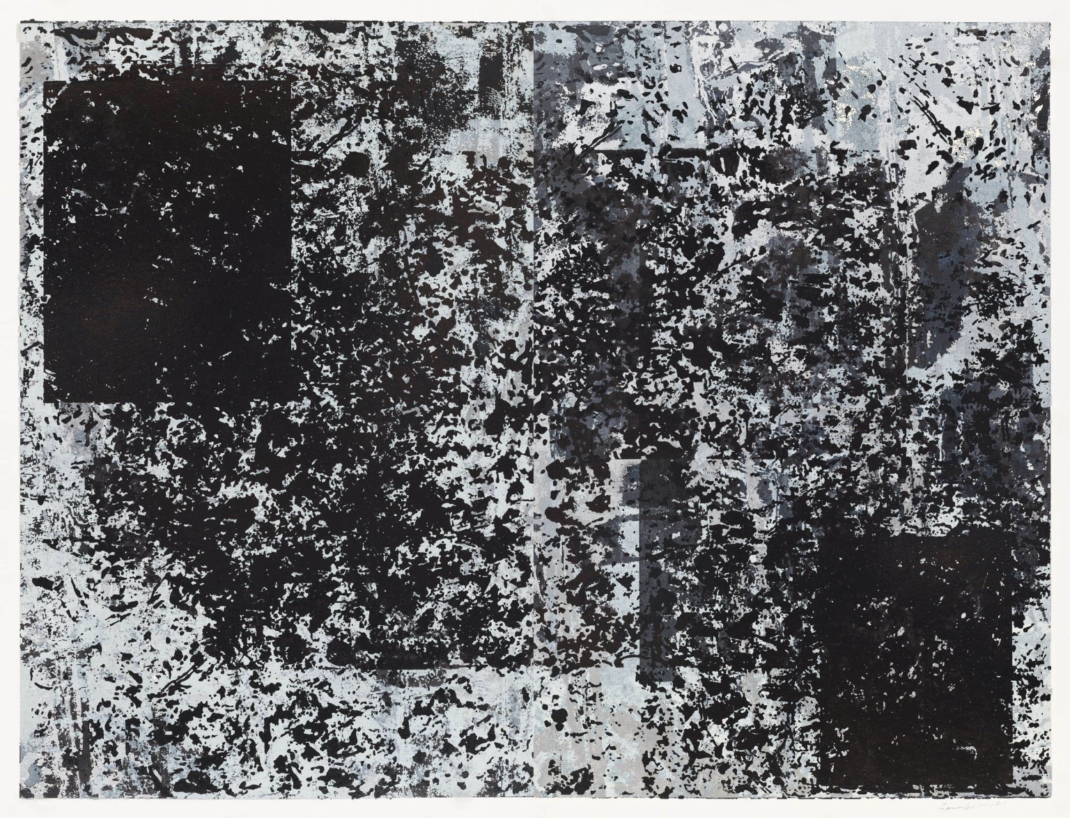
‘Untitled (2)’ 2021— image courtesy of Pace Prints
Pull back a wheatpaste poster and scrape the gum, and this is what you have left. I spent the majority of my time with this piece, ‘Untitled (2)’. We had a troubled conversation, much like me trying to tell a joke in German… In all seriousness, this piece- a synecdoche of the entire show- felt like an almost language. You’re drawn into a conversation with one whose words you desperately hang onto. You took four years of Spanish in grade school, and now you believe you can hold a conversation with a native speaker, so you puzzle together a rough translation of their sentences using your remedial memory of conjugations and nouns. Think Braille, flattened and visibly taunting. I found myself moving from side to side of the works, wondering if there was, in fact, language embedded into the monoprint’s surface, only visible from a designated angle.
There exists a sense of digital obfuscation in this show. My eyes did a gestalt thing and I was seeing fragmented QR codes in many of the works. Chronically online, no. Internet historian, yes. I’m like Legacy Russell, but less smart.
That said, the aforementioned experience of the work and myself having an ‘almost conversation’ may have stemmed from Gilliam’s adaptation of digital noise in this body of work. Let’s take the act of printmaking itself- a system of repetitive actions producing a marginally different image with each rendition. Using this description of a printmaking praxis, we can draw parallels to Hito Steyerl’s concept of the Poor Image.
“The poor image is a copy in motion. Its quality is bad, its resolution substandard. As it accelerates, it deteriorates. It is a ghost of an image, a preview, a thumbnail, an errant idea, an itinerant image distributed for free, squeezed through slow digital connections, compressed, reproduced, ripped, remixed, as well as copied and pasted into other channels of distribution.”
— Hito Steyerl, In Defense of the Poor Image [2009]
In this regard, printmaking is the analog screenshot and repost. Okay, walk with me here… If the silkscreen/linoleum/woodblock/intaglio plate is the screenshot, then the press and the edition are the repost.
While Hito describes digital noise (grain) as “the debris of audiovisual production, the trash that washes up on the digital economies’ shores;” let us consider that an ink roller oft picks up dust particles or bits dried ink, creating discrepancies from one edition to the next—discrepancies akin to grain. That noise is implicit in a printmaking praxis. Interestingly enough, the allure of the medium is in the “transience of the copy.”
Coupled with my digital interpretation of ‘Untitled (2),’ do you see the American flag? It’s a sort of inversion; a negative of a Betsy Ross. “Networks in which poor images circulate…[become] a battleground for national agendas” You see where we’re headed?
Good cus I’m not writing more.
I trust your mind.
2am in chicago and i’m going ice skating tomorrow. tchusssssiiiii <3
drink ya water, love2u.